
This arrangement allows the magazine's front cover to use the space appropriately while having an effective positioning so the audience are straight away connected to the main image which entices
the target audience.
This arrangement is different to the last one because the anchorage text has a different location so it is noticed more in comparison to the other magazines anchorage text. Also the use of the puffin location which cause the user to pay attention to the magazines front cover.

By allowing the anchorage text to be on top of the main image will cause the anchorage text to have more of an effect on the user due to it standing out more to the target audience. Also this edition has cover lines with images, this will attract the user to read and pick the magazine up because there is a bigger possibility to see an interest which is featured.
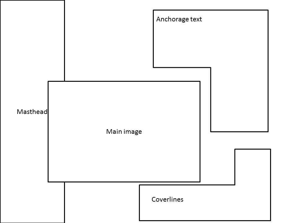
This is completely different because it uses a masthead which is going in a vertical position so the audience will notice the unique quality of the magazine front cover, this will also help the audience to see the magazine due to it standing out, this will cause the magazine front cover to be iconic.

The coverlines and anchorage text are on top of main image, this will give the anchorage text and coverlines to have more attention paid to them, Furthermore, the main image doesn't lose much of the main attention because the text doesn't cover much of the image, the masthead is also in the centre so the magazine is more approachable.
No comments:
Post a Comment