Wednesday 30 December 2015

Costume Consideration

My house style of my magazine relates to the genre which is heavy metal. Therefore, I will conform to the stereotype and common conventions of the attire of the metal fans, this will ensure I appeal  to target audience as it relates to their day to day life. The stereotypes related to metal fans is that they're violent and depressed so to display that in my images, I will get my model dressed in dark clothes which give a gothic vibe. The clothes which will appear in the magazine will be common clothes which the audience typically wear so I will use clothes typically come from shops which my audience shop at so Primark, Blue Banana, Topman etc.


Friday 18 December 2015

Audience research for masthead designs.


This is my audience research which has impacted my decision which planning and designing. The use of Kyle's comments have allowed me to understand in more depth what my target audience would like to see and expect from a metal/rock magazine.

Hand drawn designs for my magazine design.


These are hand drawn designs which I drew when designing and planning my magazine for my certain genre which was widely affected by my house style magazine.

Wednesday 16 December 2015

Photo planning

Things to consider before taking the main photograph that'll be used on the front colour.

  • Research into main images-theme DONE. 
  • Model planning DONE.
  • Camera Research (tech)
  • Locations DONE
  • Photo editing research
  • Makeup research DONE
  • Costume considerationDONE
  • Lighting research
  • Photo Schedule 
  • Composition
  • Props DONE
  • Revision of or consideration of conventional shot types

Tuesday 8 December 2015

Researching my main image.

Most of the shot types range from medium shots to close ups depending on how many subjects are visible in the main image, for example in the images with one subject the shot chosen are usually close ups to reveal their facial expression. However, sometimes you will find that the shot type is a medium shot which is used by the producers to allow the target audience to see the costumes visible, the setting/location, and also the background images which can be seen. For example; in the second image from the bottom left the audience can see a viking scene with is evident through the costumes and props.
From the main images which I chose to include, many of them feature the band members which could be used to attract more of the audience through having more celebrities. However, a few which I have chosen feature only the vocalist from the bands, this is evident with Corey Taylor's images when he is featured on the front cover without Slipknot's other band members, this can be due to Corey being the symbol of Slipknot within the media. Therefore, Corey is the most well known member of Slipknot so by using his image it will spread the reputation of Slipknot through more of the target audience taking an interest in the band.
Within this genre and this magazine, all the images I have chosen with one exception,all use dark costumes which reveals the genre and what the bands lyrical background will be based off for example the use of bright colours suggests that the lyrics will be clean without swearing, and dark colours suggest that the lyrics will be based off emotions and pain.

Tuesday 24 November 2015

Tuesday 20 October 2015

My questionnaire results.

My results show that my target audience usually read 1-3 times a week so I can alter and adapt my magazine to suit and conform to them.
When I asked the question which masthead is more effective, I got a joint popular answer of A & B which will effect my decision on which masthead to include in my school magazine, this will help more of my target audience feel like my magazine is more approachable which will result in more of my target audience becoming interested in my magazine. 
I used the question "Is my masthead effective?" and most of the responses were yes so based on the feedback I am going to maintain the standard of my masthead's effectiveness.

September Feedback.

Pupil comment:
I will try to continue to keep my work at a high standard, and to make different aspects of my own work better by doing more independent research in certain areas. Furthermore, I will add more detailed analysis and descriptions. Throughout my coursework I will try to further my knowledge and try to make clearer links top key terminology and concepts in my analysis.

Monday 19 October 2015

My school magazine design.

Evaluation: 
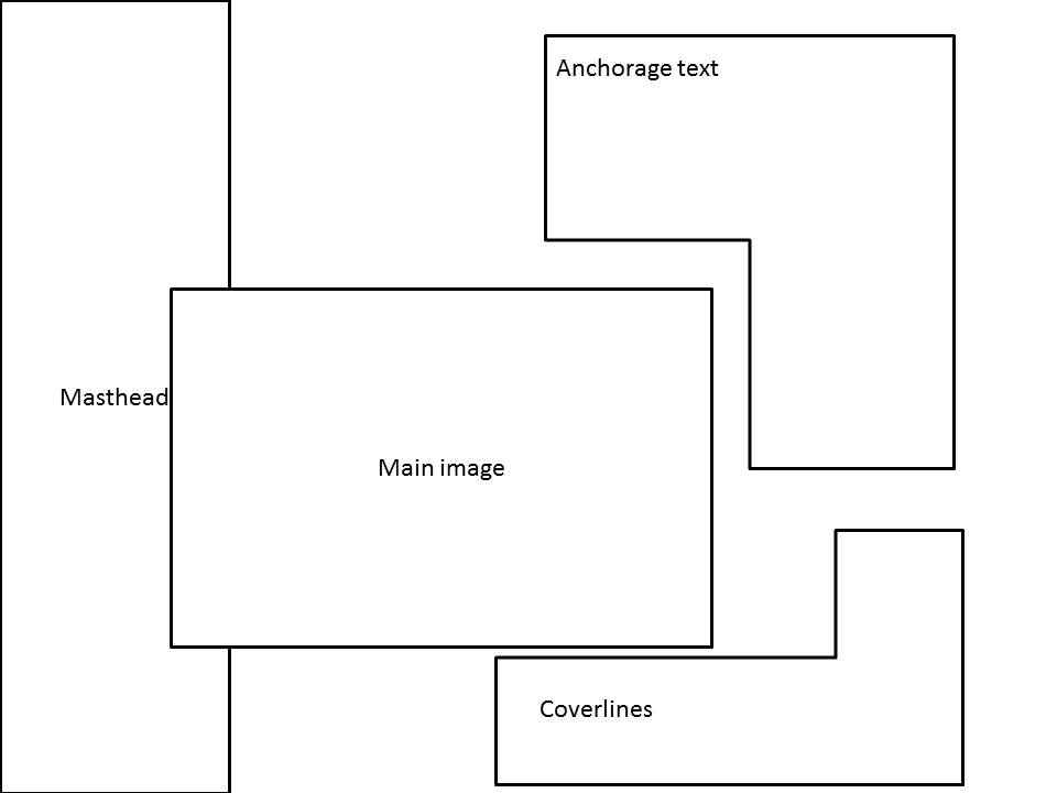
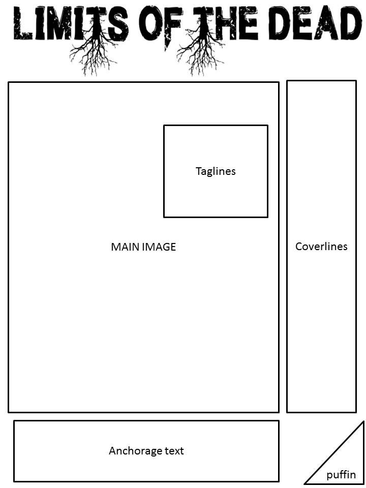
The bold Masthead is convention for a magazine due to catching the target audiences eye, this will also help make the magazine more iconic. This is expected to appear on the top of the front page due to informing the audiences as soon as they look at the masthead, about what the genre the magazine is. 
My front cover features the school logo beneath the masthead, this if common due to the designers wanting to catch the target audiences attention, this will also cause the audience to instinctively know what the magazine is about due to linking the logo with their own knowledge, this is the reason I used the Plantsbrook due to the logo being well known and therefore informing anyone who picks up the magazine that its in relation to Plantsbrook school.
I also placed a puffin text to conform to a common magazine, this will give the target audience more incentive to pick the magazine up. This feature often are placed in the corner of the front cover so the offer is clearer and easier to notice therefore taking target audience into consideration.
To avoid confusion between anchorage text and coverlines, I decided to keep them different colours and place them in different locations on the front cover, while still keeping the colour scheme matching and effective. My colour scheme consists of the colours black,white,red and silver, this conforms to the conventions of a typical magazine front cover due to wanting the audience to find it attractive and pleasant to look at, furthermore, by making the magazine look more professional the developers benefit because it reflects upon the audience having a clear idea about the professionalism of the magazine and developers involved in designing the front cover.
My school front cover challenges conventions by having used pull text, which is a quote from an article used to entice the target audience into reading the magazine, on the front cover. This isn't seen very much on front covers, however I chose to go against convention due to wanting my magazine stand out to the audience and due to this decision my magazine will attract the audiences' interests due to becoming intrigued at a section of an article which is featured in my magazine.
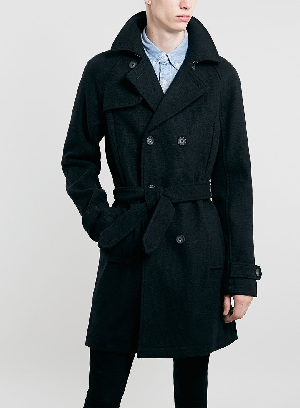
My magazine has also challenged convention in relation to my main image, usually the designers and editors remove and edit buildings out of the main image so more attention is placed on the main attraction, this also stops the front cover looking too crowded. However, I decided not conform to their expectations due to deciding that the building involved in my image was important to the magazines image, and the image of the building is linked to one of my anchorage texts. Also in my opinion editing the building using fireworks would lead to the magazine looking incomplete and tacky.

The audience in which would be interested in my school magazine would be 12-18 year olds due my the feedback I received from my questionnaire, these ages are relevant because 12-18 year olds are the age ranges for the students at Plantsbrook.

I attracted my target audience by using puffin text , which is a freebie within the magazine , which persuades the audience to pick the magazine up, I have put a clear indication on my front cover so the target audience know that there is free stuff involved in my magazine.
Another way I attracted the audiences interests was by including a pull text on my front cover which will cause the audience to take an interest into my magazine.

Thursday 15 October 2015

A questionnaire to help me change and conform my designs, I have gathered some feedback off the results of the survey. https://www.surveymonkey.com/r/V5HR9HS

Tuesday 6 October 2015

Different drafts of my Plantsbrook Magazine.

This is my first version of my Plantsbrook Magazine draft, it features a puffin which will persuade the target audience to participate in the competition and to keep the magazine so the information provided wont go to waste. The use of the friends of Plantsbrook will attract the target audience due to the organisation being well known to have a great relationship with Plantsbrook personally.


This is my second version of my School magazine draft,  it uses the template which has the main image in the centre of the page with the coverlines and anchorage text surrounding it, this will lead to the cover lines and anchorage text being more noticeable to the audience so this increases the possibility of  selling/giving away more copies of the magazine.

Monday 5 October 2015

Magazine locations

 
This arrangement allows the magazine's front cover to use the space appropriately while having an effective positioning so the audience are straight away connected to the main image which entices 
the target audience.


This arrangement is different to the last one because the anchorage text has a different location so it is noticed more in comparison to the other magazines anchorage text. Also the use of the puffin location which cause the user to pay attention to the magazines front cover.

 
By allowing the anchorage text to be on top of the main image will cause the anchorage text to have more of an effect on the user due to it standing out more to the target audience. Also this edition has cover lines with images, this will attract the user to read and pick the magazine up because there is a bigger possibility to see an interest which is featured.

This is completely different because it uses a masthead which is going in a vertical position so the audience will notice the unique quality of the magazine front cover, this will also help the audience to see the magazine due to it standing out, this will cause the magazine front cover to be iconic.

The coverlines and anchorage text are on top of main image, this will give the anchorage text and coverlines to have more attention paid to them, Furthermore, the main image doesn't lose much of the main attention because the text doesn't cover much of the image, the masthead is also in the centre so the magazine is more approachable.

Friday 2 October 2015

What I have learnt during my photography lessons.

During my first and second photography lesson, I have learnt different techniques to use while creating a portrait in photography:
Rule of thirds-
The rule of thirds are used as a guideline for the photographer so it helps with the process of taking visual images.Apparently an image is more pleasing when the rule is used due to the eye level complimenting their feature. An example of what the rule of thirds look like on a camera is:


Depth of field-
Depth of field is the distance between the nearest and furthest objects that appear sharp in the photograph. The distance depends on the subject and what the photographer wants to achieve with his model and setting.
Shallow depth is when the subject is clear while the setting around them is not in focus so the background is blurred out.
High depth field is when the subject is not in focus so the subject is not the main attraction due to them being blurred out, the background however is clearer due to being in focus therefore the audience pay attention to the background first.
Lighting(hard/soft/natural/flash)-
Lighting is very important in the process of taking photographs.
There are different ways lighting can be altered for example
Lighting Arrangements:
Fill Light- low down, somewhere in front of the camera, it fills the scene.
Back light-behind the characters to create shadows.
Key light- behind the camera to cast light on the scene.
High key- high up which causes the scene to have loads of light.
Low key- low down, causes loads of shadows in the scene.
Visual Lead in-
A lead in can be any line that takes the audiences attention towards the main attraction image.


Movement -
Movement can bring an image to life,the blur within a photograph can show the idea of movement to the audience and who ever is looking at the pictures


Subject/Model Position-
The position of the object/subject will tell a story to the audience, they don't always have to be posed for , they can be natural

Lesson 2 in Photography


Created with flickr slideshow.

Photography Lesson 1


Created with flickr slideshow.

Monday 21 September 2015

Different tools that can be used in my media coursework.

Blogging Tools

PodOmatic

This website allows create and upload your own podcast or find a variety of free podcasts, this website is a very creative way to use different elements of giving the audience information , this will allow students to express their ideas in different methods in order to impress their target audience. Personally I like the way the voice recordings and podcasts aren't distraught which will represent professionalism within the forum or blog community which it will be posted on. This will be useful for blogs to explain to the process of something, step by step.


Google Calendar

This tool allows the user to plan lessons, exams and keeping track of assignments and deadlines. how ever this tool requires a google account to access. This will allow the audience to be keep with work they are given for example posting regularly for a blog due to the set plan, this benefits me because it syncs with my phone so it sends me notifications  through my phone. 


PhotoBucket 

This website is used regularly by a wide range of people , this can be used to store and share your images and videos for no cost! Its very handy for transferring files between your home and work computer. This will come very handy due to having easy steps of transferring files and images to your school and home computer , this will also allow you to share images with the the teacher so you can get feedback!