Tuesday 12 April 2016

Question 5, What did you do to attract/ address your audience?


https://www.thinglink.com/scene/776363053418545152 https://www.thinglink.com/scene/776362138208829440 https://www.thinglink.com/scene/779698446025097216

Question 4, Who would be the audience for your media product?


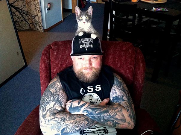
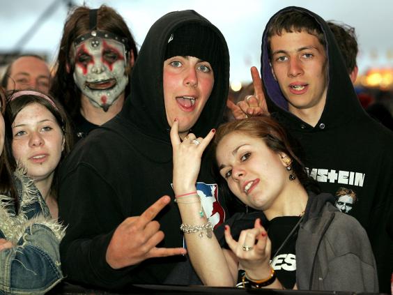
My magazine is aimed at young people age ranged from 16 years old to 29 years old which include all genders , this means a majority of my target audience tend to use the internet regularly so as a result I have decided to advertise the social media of 'Forgotten' on my magazine. Also due to my target audience being used to the internet I have decided to have a reasonable price for my magazine so my target audience don't choose to access the magazine online. Another reason for choosing this price is because a majority of my audience are unemployed due to being in full or part time education or having a part time job so they don't usually have money or time to spend reading (information gathered in research) so they don't have a stable income which will allow them to purchase an expensive music magazine as they have other priorities. As they don't have disposable income to spend on an expensive magazine, they usually spend their money on their youth which involves spending money on metal concerts and festivals which occur every year eg Download, Bloodstock etc. In addition my target audience spend their money on major priorities like music (found on iTunes), phones (upgrading to the most recent model), Tattoos, piercings etc. My target audience would usually shop online for clothes as the typical high street doesn't tend to cater to metal fans so as a result, my audience would shop online at www.emp-online.co.uk/clothing/ which offers a large range of metal/rock bands merchandise. However, if my audience was going to shop in a town centre, Town in Birmingham for instance then my consumers would shop at blue banana or Oasis market. Other on the hand my target audience have the ability and tendancy to buy dark colour clothes from topman or primark.
Values which my target audience live by tend to be spending time with family and friends, in the park, school, home life, online with social media, online on gaming consoles, cinema, youth clubs, sports clubs etc. They will spend their day to day life aside from education or careers on social media and spending time with the most important people in their life because aside from stereotypes, ,metal and rock fans are one of then most loyal and caring fans out their.
The most fitting phone that suits my target audience is Apple's iPhone due to being widely popular with the age ranges that make up my target audience. Furthermore, iPhone's allow my consumers to access social media and the internet to stay up to date on various updates from my magazines website. As a result of the easily accessible app store, if I wanted to use cross media convergence and synergy to create an app which can be more mobile and portable so it would appeal to my audience when out and about eg. on public transport or on a long car journey. From my research I have gathered that iPhone's iTunes easily allows everyone who has an apple product to download and install music onto their device, this can be very benefiting due to my target audience listening to music. Alternatively, on the app store, Apple also have other music apps which are music based which will help me reach a wider audience. For example, Soundcloud, Amazon Prime, Spotify, Youtube

My primary target audience are between 16-29 years old, by majority they mostly fall into group E on the JICNAR scale which is due to them being at school or university. As a result I have had to make the magazine appeal to that certain age range by using certain techniques which appeal to the audience. 
JICNAR SCALE
Group A (Professionals)
Upper middle class, e.g. Barristers, Doctors, Executives

Group B (Managerial)
Middle class, e.g. Bank Managers, Teachers

Group C1 (Non-Manual)
Lower middle class, white collar workers, e.g. Office Workers

Group C2 (Manual)
Skilled working class, Blue collar workers, e.g. Car Mechanic, Machine operators, Construction workers

Group D (Partly Skilled)
Semi or unskilled manual workers, e.g. Assembly line worker

Group E (Unskilled)
Casual workers, dependent on state benefits, students
To gather an insight into my music magazine I will hold an interview with a sample of men and women who both fit into the target audience. I will ask a range of questions which will help me in my research to learn more about my magazine. I'll upload the file to my blog via a soundcloud. 

I will ask: 
"What are your first thoughts on the magazine 'Forgotten'?
"Would it appeal to my target audience?"
"What are the Front covers Strengths?"
"How does the contents page appeal to the consumers?"
"Does the double page spread look professional?"
"Can you see any improvements or areas which I need to work with?"
"Would you spend £3.50 for this magazine?"
"Does the front cover attract you to the magazine, and does the model's mode of address allow you to make the magazine memorable?" 
Name: Kyle 
Occupation: Student
Age: 17
Hobbies: Skate boarding, Gym, Judo, Gaming, concerts. 
Gender: Male
Interests: Concerts, PC gaming, exercise, sports.
Music Tastes: Heavy metal, Rap, rock, reggae, Classical, grime, trap.

Question 3, What kind of media institution might distribute your media product and why?

https://prezi.com/xaspbeavvskb/edit/#25

Question 2, How does your media product represent social groups?

https://app.emaze.com/editor/@ACFCZOTTPowered by emaze

Thursday 31 March 2016

Final Media Draft.


Development of my Double page spread.


Since the last picture, I have changed the format of the text so it looks more professional and legible which follows common convention of a metal music magazine. I have also placed the first paragraph in a bolder font , on its own so I have a stand first which gives emphasis on it. Which causes the audience to give their attention to the starting paragraph. I also changed the colour of the boxes contain pull quote and description of the main image of the right hand side.

Since the last image, I have tried to incorporate an extra colour into my colour scheme which gives a bold effect allowing the double page spread to be more visually pleasing. I have also added a large anchorage text over the top of the main image which gives the target audience even more reason to be intrigued by the content within the double page spread. Also I have changed the format of the pull quote at the bottom so it is more appealing and therefore looking more professional to the consumers. Furthermore, I have edited the font of the pull quote in the middle of the text so it has more effect.

Since the last update I have developed my work by changing the font of one of the 'the' in the anchorage text on the main image so they don't look too similar which allows them to be unique in their own way which is more appealing to the target audience. I have also experimented with the colour scheme of the red box at the bottom. Furthermore, I have edited the smaller words in the title to a different, less impacting font so the bolder words have more effect and emphasis.

In my final development stage I have added a black blocks behind the subheadings have a bigger effect on the audience as they have a bolder effect which clearly seperates the text boxes allowing the text to be more legible.
This is the development for my double page spread.

Wednesday 23 March 2016

Final Contents page

This is my final contents, I have updated this from the last piece by creating a poster for the festival download which will reveal the lind up which entices the audience the buy the magazine and read the contents page. I have also included a high definition image I took myself at a concert I went to recently. I also added a substription box which follows the convention of a typical music magazine.I have tried to utilize all the space because space on a magazine is money for advertisements.

Wednesday 9 March 2016

Contents page

This is my second draft of my contents page, but I have some things to do to improve it.

Saturday 5 March 2016

Locations

Locations 
I want to create an image which has a dark greyish background which will allow me to stick to my house style through the colour scheme. So through saying that I am going to take some pictures in the house due to having a grey wall. However, I am still going to take some images in front of a freshly painted white wall because white is also one of the colours in the house style, also the contrast with the dark clothes and atmosphere with the white background.

Props

Props 
I am going to feature an electric guitar because it suits my house style which also will give my audience the reassurance that my magazine is a music magazine. However, I will also take pictures without props because I am planning on having my front cover having a lot on it because the reputation of my magazine being packed with content. So by having a minimist picture it shows binary opposites.

Makeup Research

Makeup Research 
To fit my house style of my magazine, I want to create a front cover picture of the model which will create a positive impact and impression on the target audience. I am using inspiration from the rock band 'Kiss' which will also allow my singer to be well recognised in the genre of music. Furthermore, by having a makeup the model has a more distinctive look/ appearance.  
Another major inspiration which I chose to idolise when I was deciding on the makeup for my model, I wanted to create a mysterious, scary look which also allows  the audience to relate to the darkness of the character which is suggested through the binary opposites.


Friday 26 February 2016

Double page spread.

Article for Double page spread

The Crowmaintain anonymity behind a black and white mask which causes audiences left stunned at this musical genius' vocal range with the uber-aggressive style mixed with a soothing potent and unapologetic lyrics, which hit an emotional area deep down in every fan.  The Crow gave us an exclusive interview in which he said "The mask for me represents much more than just trying to cover my identity, with each album I change my mask/look, because I feel as my music evolves, I also evolve as a person so this one, specifically, is supposed to represent the person behind the mask, but then the person behind that person which is one of the reasons why its in two pieces in two different colours and you can peel the one off and its still a representation. So Its almost like having two faces, but its the same person. Furthermore, I feel like having a mask which I feel matches the personality and person within myself allows me to be true to myself because I've accepted that everything that has happened to me in my life... has made an impact to who I am today."  
The Crow, started out making a name for themselves with gigs in local and backstreet stages. He's been adding to his reputation for 7 years. The Crow who's real identity and appearance still remains unknown began climbing towards his dream with very little cash and hardly any possessions to his name which is clearly portrayed through the dark lyrics which mostly focus upon depression, anxiety, death, and other dark subjects which are a part of his and everyone else's reality.  He shared with us what his inspirations were to follow his dreams and make a name for himself as a teenage boy living on the streets, making money by performing in parks for the general public. Reason why so many people love and idolise him due to staying true to his roots even though his true identity is a touchy subject, he goes against the stereotype of a metal singer and composer. Instead of letting fame get to his head he regularly visits his local area's park which he spent most of his teenage years in. Furthermore, with every pay cheque he receives he donates 40% of his income to homeless charities and charities for children going through a rough situation at home. Even though his music displays him as a ruthless badass, The Crow has shown everyone his caring side,but he is still a BADASS nonetheless. 

Not long after The Crow started making a name for himself he was instantly signed to the record label Roadrunners Records, which help promote and distribute his first album 'Hypophrenia'. Which focus' on pain, heartbreak, sorrow and hard situations in every day life.   

Final Front cover

This is my final front cover cover for my magazine. Since the last draft progression, I have created a new pug and I have edited and manipulated the text on the left hand side of the page.

Wednesday 24 February 2016

Contents Mood board and Common conventions

Common Conventions
All these contents pages feature common features which can be seen through these examples.

  • They all have either one main image which the contents page focuses on or small individual images which give the audience more interest because there are more images. 
  • Common conventions of these contents pages are that they all follow the their house style which involves font, colour scheme, whether the magazine is packed with information or if it's going for the minimalist look.
  • Due to being a contents page, all of these examples all feature page numbers.
  • Across all the examples Ive chosen to review I can see that 'Contents' is always featured as a bold heading at the top of the page, which can be bold due to the bold colour scheme or the size or font.
  • From the examples I have chosen, a common convention is to have a caption/ anchorage text of every image which is featured on the contents page.
  • All contents pages all follow a structural layout which makes the product look ascetically pleasing.
  • On some examples I have seen, a factor which is quite common is an 'editors pick' section which gives the audience an insight into a new band they may not be as well known.
  • There are always numbers at the bottom of the pages which will be guide the audience to the articles they want to look at.
  • They are usually one or two pages.
  • There are always sub headings like featured, news/reviews, on the cover which divide the text so the magazine has structure.
  • In some cases, the page numbers are set in chronological order so its easier for the audience to read

Progression

Ive changed the kerning between the Coverline "This is War" so it looks like the text belongs together. Furthermore, I have edited the bands at the top and bottom of the page so it looks more professional due to following conventions of fellow heavy metal magazines.
I also emphasized the bands/ artists in the coverlines, and I gave them bolder colours so the audience are drawn to it.

Progression


Progression


Progression


Tuesday 16 February 2016

My decision for my front cover main image.


These were all options for my front cover due to the direct address made by the photographer. 
I have started editing two of the three photos which may feature on my front cover. I am going to choose the first image due to the makeup used represents my genre as it reflects darkness by binary opposites, also it doesn't require me to edit another background between the main image as it doesn't have different textures and materials, plus the second image has objects in the far left which could be cropped.

Friday 12 February 2016

Final Draft

This is my finally front cover which I create through taking feedback on board from my teacher and fellow media students, I was instructed to have my emphasis on the "The crow" and with the band/artists names so the audience can easily identify who will be featured in the magazine which will will attract the consumers. Furthermore, I used binary opposites to also highlight the artists name like Paul Gray which leads the audience to see the importance of that artist in the music industry and in my magazine.

Draft 2

This is my second draft and I have altered the text sizes and fonts and the model picture I use on the front cover. I also created a new pug for my front cover to attract the audience.

Draft 1


This is my first draft of my music magazine.

Monday 1 February 2016

What is kerning?

Kerning is the process of adjusting the spacing between characters in aproportional font, usually to achieve a visually pleasing result. Kerning adjusts the space between individual letter forms, while editing the different letters in which is highlighted.