Magazine Variations

This magazine shares some traits within the different media magazine organisations. For example, the logo of the magazine is BOLD and is always positioned in a certain location, In this case, the black and white logo rests in the left hand corner. The fact that the logo is bold also makes the magazine stand out, drawing in the target audience and encouraging them to pick it up and buy it. This will help increase the magazine's sales and profits.
The Strapline is used to make the audience continue reading on.

The magazine has BOLD text in contrasting colours to the background for example the blue background contrasts with the big gold text, this allows it to be more visible to the users, this can also be seen as a clever decision due to the producers choosing to make the bigger attractions in a more visible text. This is evident when Jimi Hendrix is in a bold gold font but Greider On Buchanan is in a smaller blue font which can be debated to be less visible.
This magazine uses a black and white colour scheme to demonstrate the theme of traditional, this interlinks with music genre because country music can be seen as traditional.
The use of puffins is also used to make sure the target audience buy the magazine, this is a clever strategy to make sure people buy their magazines and read the information they have wrote about.
In this edition they have used johnny cash to feature on the front which will appeal to make of his fans , but to make sure everyone knows Johnny cash is featuring on it they put his name in a massive white font which becomes even more bold after it is placed on a black canvas.
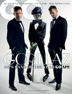
 This magazine used more than one member of the artist so they have used a wider space in between them , as a result they have put less text and images around them so it doesn't take away from the effect of the main attractions.
Both the magazine logo and band name are both using the same colour scheme so the text in black and white appear bolder which suggests more audience would see it and become interested in what is being talked about.
In most of the magazines the artists are usually covering the masthead which could lead to the magazine looking more appropriate and creative.
The use of puffins is also used to make sure the target audience buy the magazine, this is a clever strategy to make sure people buy their magazines and read the information they have wrote about.
In this edition they have used johnny cash to feature on the front which will appeal to make of his fans , but to make sure everyone knows Johnny cash is featuring on it they put his name in a massive white font which becomes even more bold after it is placed on a black canvas.
 This magazine used more than one member of the artist so they have used a wider space in between them , as a result they have put less text and images around them so it doesn't take away from the effect of the main attractions.
Both the magazine logo and band name are both using the same colour scheme so the text in black and white appear bolder which suggests more audience would see it and become interested in what is being talked about.
In most of the magazines the artists are usually covering the masthead which could lead to the magazine looking more appropriate and creative.
This magazine uses the same colour scheme throughout which causes the magazine to seem more professional and modern , which links in which the band's style and the genre of music the target audience listen to. The idea of clean is played with due to using white , but with messing with graffiti , this could reflect upon the bands image as rebellious. This is further proven through the stereotype of tattoos , and both band members have tattoos visible to the audience.
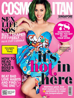
 In this magazine the colour scheme is purple which is used as some of the text and background colour, this creates an effect due to Katy Perry wearing white , this also adds to Katy Perry's image as it gives off a positive image to her as it suggests that shes bold, unique and doesn't like to follow the heard. This magazine uses puffin to add to enticement for the target audience to purchase the magazine.
The caption "it's hot in here" uses the theme of female attraction to attract the male audience. However, the coverlines and anchorage text suggest that the magazine was made with the female user in mind, this is further proven through the colour scheme used in this edition of the magazine.

No comments:
Post a Comment