Tuesday, 29 September 2015
Tuesday, 22 September 2015
Monday, 21 September 2015
Different tools that can be used in my media coursework.
Blogging Tools
PodOmatic
This website allows create and upload your own podcast or find a variety of free podcasts, this website is a very creative way to use different elements of giving the audience information , this will allow students to express their ideas in different methods in order to impress their target audience. Personally I like the way the voice recordings and podcasts aren't distraught which will represent professionalism within the forum or blog community which it will be posted on. This will be useful for blogs to explain to the process of something, step by step.Google Calendar
This tool allows the user to plan lessons, exams and keeping track of assignments and deadlines. how ever this tool requires a google account to access. This will allow the audience to be keep with work they are given for example posting regularly for a blog due to the set plan, this benefits me because it syncs with my phone so it sends me notifications through my phone.
PhotoBucket
This website is used regularly by a wide range of people , this can be used to store and share your images and videos for no cost! Its very handy for transferring files between your home and work computer. This will come very handy due to having easy steps of transferring files and images to your school and home computer , this will also allow you to share images with the the teacher so you can get feedback!
Friday, 18 September 2015
Thursday, 17 September 2015
Magazine Variations

This magazine shares some traits within the different media magazine organisations. For example, the logo of the magazine is BOLD and is always positioned in a certain location, In this case, the black and white logo rests in the left hand corner. The fact that the logo is bold also makes the magazine stand out, drawing in the target audience and encouraging them to pick it up and buy it. This will help increase the magazine's sales and profits.
The Strapline is used to make the audience continue reading on.

The magazine has BOLD text in contrasting colours to the background for example the blue background contrasts with the big gold text, this allows it to be more visible to the users, this can also be seen as a clever decision due to the producers choosing to make the bigger attractions in a more visible text. This is evident when Jimi Hendrix is in a bold gold font but Greider On Buchanan is in a smaller blue font which can be debated to be less visible.
This magazine uses a black and white colour scheme to demonstrate the theme of traditional, this interlinks with music genre because country music can be seen as traditional.
The use of puffins is also used to make sure the target audience buy the magazine, this is a clever strategy to make sure people buy their magazines and read the information they have wrote about.
In this edition they have used johnny cash to feature on the front which will appeal to make of his fans , but to make sure everyone knows Johnny cash is featuring on it they put his name in a massive white font which becomes even more bold after it is placed on a black canvas.
 This magazine used more than one member of the artist so they have used a wider space in between them , as a result they have put less text and images around them so it doesn't take away from the effect of the main attractions.
Both the magazine logo and band name are both using the same colour scheme so the text in black and white appear bolder which suggests more audience would see it and become interested in what is being talked about.
In most of the magazines the artists are usually covering the masthead which could lead to the magazine looking more appropriate and creative.
The use of puffins is also used to make sure the target audience buy the magazine, this is a clever strategy to make sure people buy their magazines and read the information they have wrote about.
In this edition they have used johnny cash to feature on the front which will appeal to make of his fans , but to make sure everyone knows Johnny cash is featuring on it they put his name in a massive white font which becomes even more bold after it is placed on a black canvas.
 This magazine used more than one member of the artist so they have used a wider space in between them , as a result they have put less text and images around them so it doesn't take away from the effect of the main attractions.
Both the magazine logo and band name are both using the same colour scheme so the text in black and white appear bolder which suggests more audience would see it and become interested in what is being talked about.
In most of the magazines the artists are usually covering the masthead which could lead to the magazine looking more appropriate and creative.
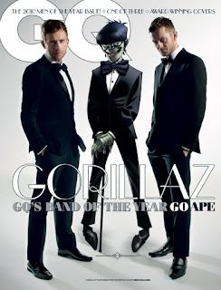
This magazine uses the same colour scheme throughout which causes the magazine to seem more professional and modern , which links in which the band's style and the genre of music the target audience listen to. The idea of clean is played with due to using white , but with messing with graffiti , this could reflect upon the bands image as rebellious. This is further proven through the stereotype of tattoos , and both band members have tattoos visible to the audience.
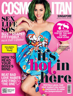
 In this magazine the colour scheme is purple which is used as some of the text and background colour, this creates an effect due to Katy Perry wearing white , this also adds to Katy Perry's image as it gives off a positive image to her as it suggests that shes bold, unique and doesn't like to follow the heard. This magazine uses puffin to add to enticement for the target audience to purchase the magazine.
The caption "it's hot in here" uses the theme of female attraction to attract the male audience. However, the coverlines and anchorage text suggest that the magazine was made with the female user in mind, this is further proven through the colour scheme used in this edition of the magazine.
Wednesday, 16 September 2015
Q magazine
Dave Grohl from the rock band 'Foo fighters', who has previously linked to 'Nirvana' and 'Queens Of the Stone age' has recently been chosen by the producers of the magazine 'Q' to be used as the front cover.
From what the audience can see, we can tell that the producers are trying to have a positive outlook on the band Foo Fighters, this can be suggested by Dave Grohl's image covering most of the front cover which suggests that he is the main attraction.
This is further proven through the caption which represents the Foo Fighters as hard working "THIS WILL KILL ME!" The red font creates contrast against the jet black background which allows the text to be more visible to the audience.
Denotation
In the image the audience can see a large image of Dave Grohl, with an edited section within Dave's mouth. The editing portrays the band 'Foo fighters' surrounded by a red and orange background. Visual elements that can be seen contain facial expressions which are angry due to him being in mid shot of screaming. Dark colours have been used on a lighter background to make the main image more bold.Connotation
Due to the dark colours, it reflects on the band as dark and mysterious which could result in a wider fan base, Furthermore, the dark colours have been specifically chosen to appeal to a certain target audience which would result in more magazines being sold. The use of angry/rage suggests that the singer of the band still has fight and energy left in him which portrays him as diligent and and conscientous, which again reflects upon him and the band greatly.The editing in the mouth suggests heat and passion through the warm colours of red and orange being used, this also presents the band in a great way due to the idea of them putting all their energy, fire and effort into making music and performing live infront of their millions of fans, this can be evident through the fire and through the caption "THIS WILL KILL ME!"
Previously the band have been on the front cover of Q Magazine were the lead singer Dave Grohl featured on the front. The use of light colours and the pose given by Dave Grohl gives a great outlook on the band's image, the first edition which the band featured on was during their discovery faze which was when they were still figuring out their style of music and the opinion they want to express through the media text. The use of the bright colours are positive aspects which a used to create a positive outlook on the band. This completely contradicts the image they are giving off in the most recent edition, the producer chose to use darker and more negative colours to create a positive image of the band! Through using light and dark colours in both of the editions the band create an image for themselves which attract the audience of the most recent fans and the hardcore fans which have been loving their music since 1994!
Dave Grohl and the band have constantly been demonstrating that they have been giving an attitude of 110% ever time they perform whether its in the studio creating a new piece of music or performing live infront of their fans! A great example of this is when Dave Grohl broke his leg on the stage of a concert in Sweden, the story was so big it waqs coverede by the BBC! (http://www.bbc.co.uk/news/entertainment-arts-33121165)
Subscribe to:
Comments (Atom)


